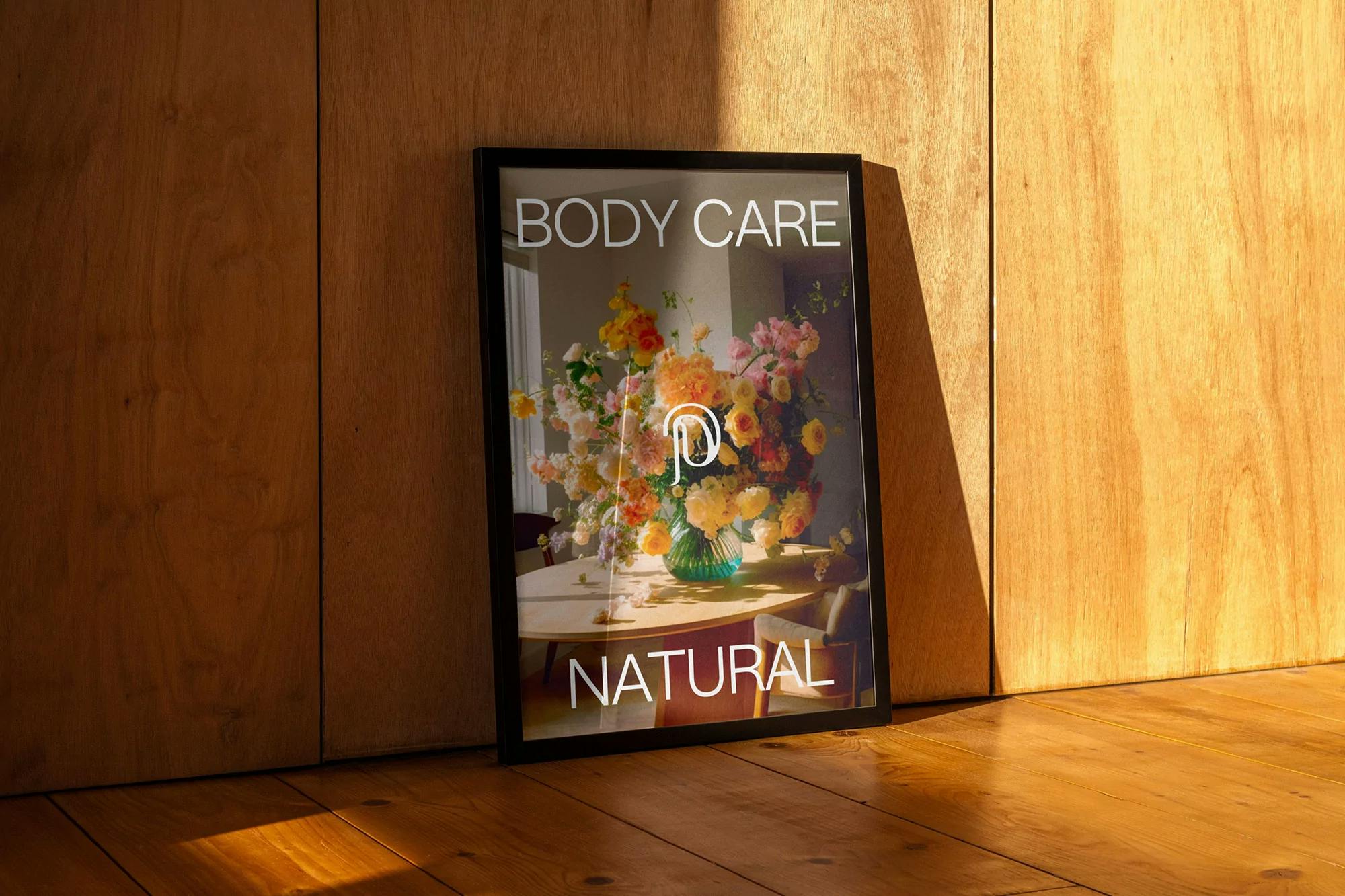
Plants and purity
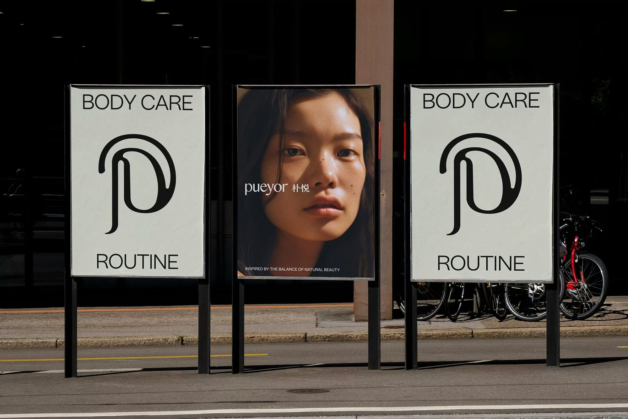
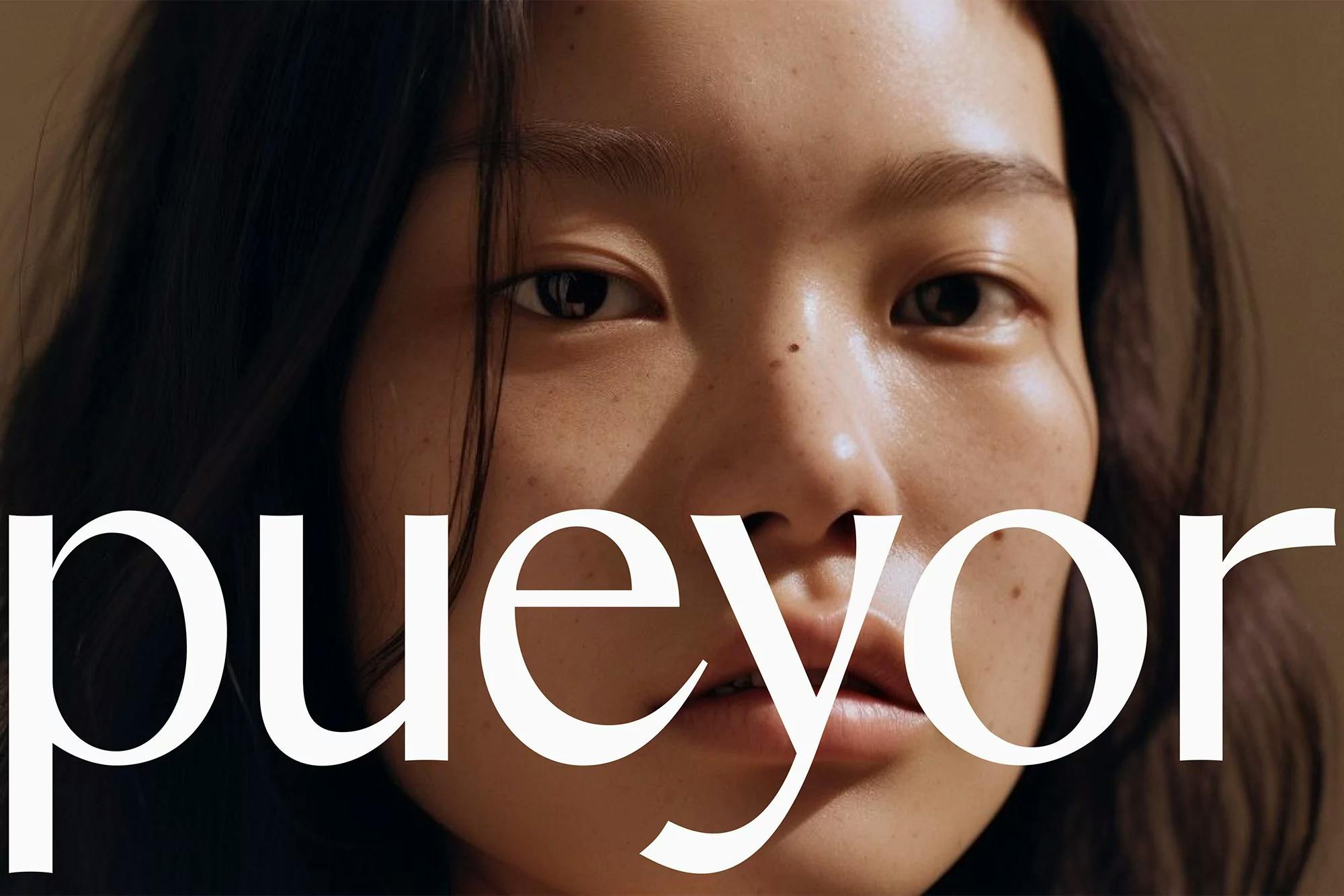
Identity for Pueyor combining multiple languages
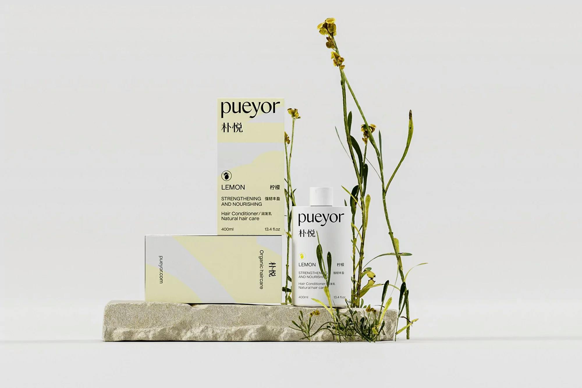
Our involvement
Fitting both English and Chinese text in the layouts posed several challenges,” CAE Collective’s Creative Director Christophe Branchu tells us, discussing the design process behind the Shanghai-based studio’s brand and packaging design for vegan haircare brand, Pueyor. “Our main objective was to prevent the packaging from appearing cluttered or overloaded with text,” Branchu continues, looking to cut through the noise of China’s emerging plant-based haircare market, decisively selecting the specific English and Chinese information displayed.
“This involved several rounds of iteration to achieve a balanced layout that feels both informative and aesthetically pleasing,” he recalls, finding a similar balance in the brand’s type choices, having to find an appropriate typographic pairing between the two scripts. “Simplified Chinese font licenses can also be expensive,” Branchu explains, “so we had to be mindful when making our selection,” resulting in the use of a cohesive, pragmatic pair of sans and serifs – led by Heavyweight Type’s grotesque, Nuckle.
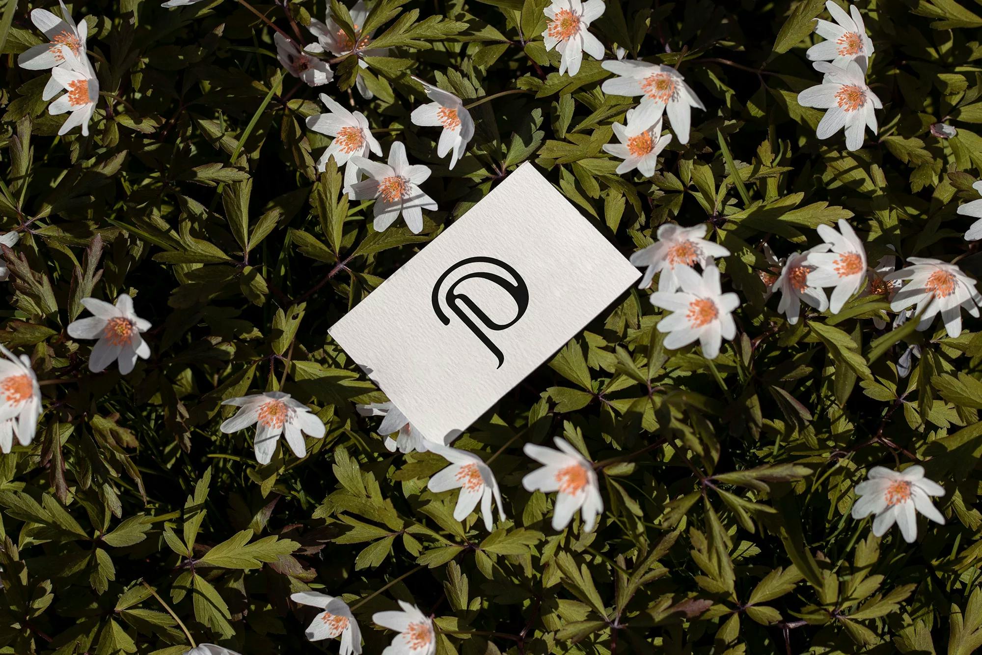
Guiding Pueyor’s typographic choices are the brand’s bespoke wordmark, the fluid forms of which not only capture the physicality of the company’s products but also a luxurious lifestyle.
Do you have a project in mind?
Contact